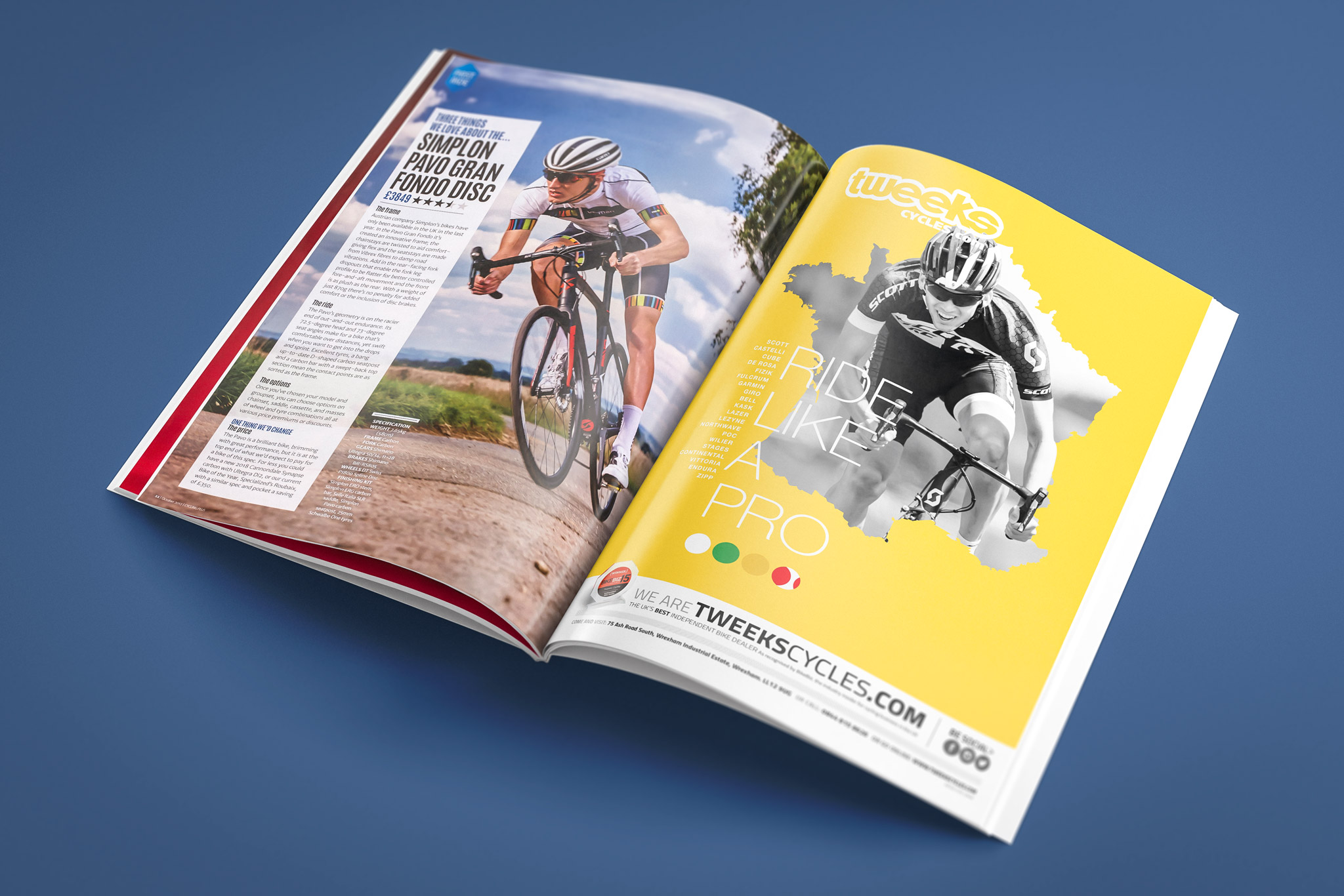
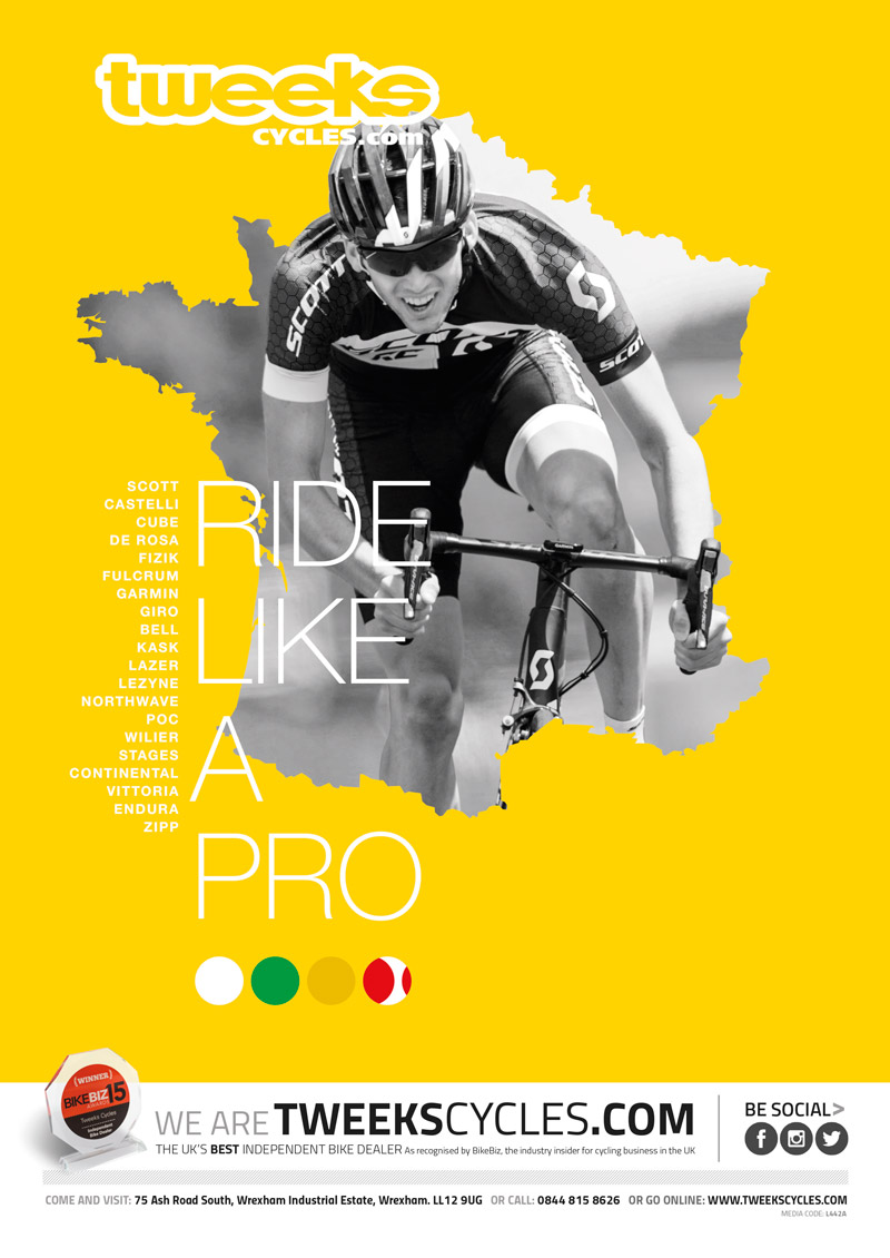
Ah the tour, something I used to watch on the TV when I was around 11 years old. I think the sense of freedom appealed to me. The original brief was to create a tour themed single page advert to run in the cycling press for Tweeks Cycles. With the tour there are many an iconic scene’s that could be drawn upon; the mountains and their chalk graffiti, the Eiffel Tower, the Arc de Triomphe and with this ad I mocked up various different designs but they all had the same element – the Yellow. I knew I wanted to make it quite simple and akin to some of the tour posters that are already part of the visual language for the tour. So I used a very stripped back pallet and a simple visual of a rider bursting through the silhouette of France which also served to frame the rider. this was coupled with a simple hook ‘Ride Like a Pro’ in the TC house font. A list of stocked brands informed the ‘aspiring tour rider’ of what they could expect to find and small circular tour jersey elements gave a bit of extra detail.
TOUR DE FRANCE - OVERVIEW
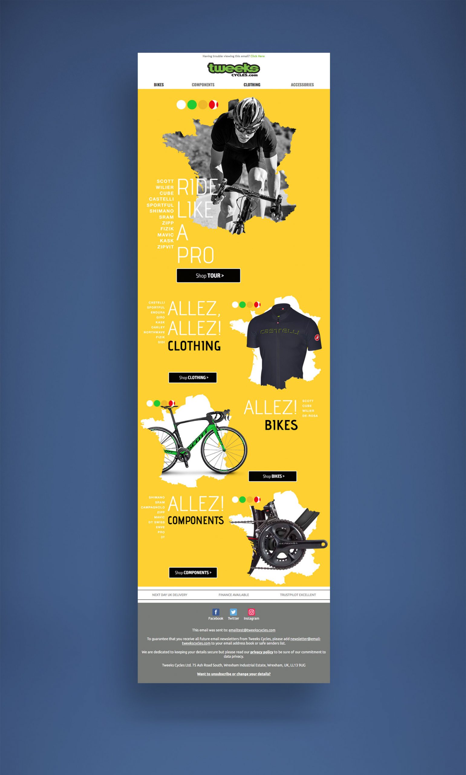
I also adapted the print ad for email continuing with ‘bursting out of’ theme. This email was broken down into section categories of the web site. It would have been nice to do some profiling and send some follow-up offers based on clicks but demon tweaks are not at that point with its marketing – yes, I know!!!
I feel the overall look and feel of this campaign worked quite well and hopefully showed our customers that Tweeks Cycles is a company that’s just as into cycling as they are. Hopefully, that message is communicated in a sympathetic manner, reinforcing trust and confidence in the Tweeks Cycles brand.
SKILLS USED
- Brand Reinforcement
- Layout
- Teamwork
- Research
CONTRIBUTORS
- Myself
Research & Design
- Craig Price
Brainstorming
As Published In
