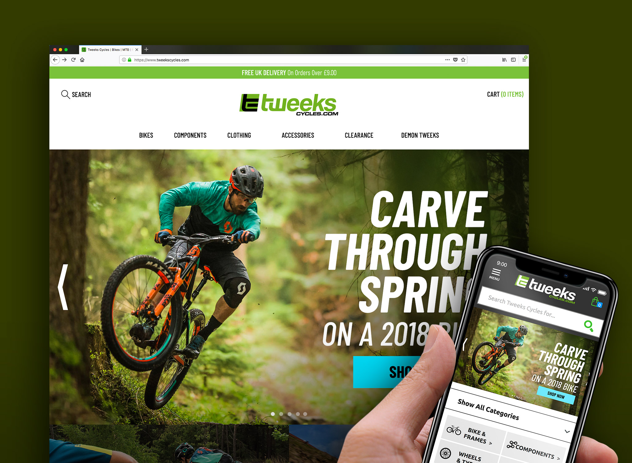
As part of the re-development of the Tweeks Cycles website an external agency redesigned the Tweeks Cycles logo . What was put forward was not suitable for the brand ethic or the target audience.


TWEEKS CYCLES LOGO UPDATE - OVERVIEW
As a team at Demon Tweeks, we worked to present our own redesign of the logo. We each put forward some designs and refined our ideas down to a shortlist. The logo here is what I had developed and put forward with elements from some of the other designs from my co-designers (the ‘tc’ icon). Overall I think we achieved a dynamic logo that still retained some feel of the original, helping to keep the brand continuity and keeping it recognisable as Tweeks Cycles. This logo wasn’t used but I did eventually get to redesign it.
SKILLS USED
- Logo Design
- Branding
CONTRIBUTORS
- Myself
- Gary Forshaw

Logo treatments. A guide for usage.
